Learning HTML and CSS with CodeAcademy
~ Resources for building a Website
Course Dates:
Concepts to Research or write about later
digital accessibility → https://www.w3.org/TR/WCAG21/
Ada Lovelace → first programmer??
Learning HTML & CSS
HTML = Hyper Text Markup Language
<span> is better to seperate inline text, <div> is better for separating/identifying blocks
<img> tag is self closing but has a required attribute of "src" so it must always look like <img src=:"">

HTML docs always begin with the first line being : <!DOCTYPE html>
- then the <html> tag
	- then under that lives the <head> and <body> tags

anchor elements, or links, have the href attribute. <a href="">
	target="_blank" is an attribute you can add to "open in new tab"
	 <a href="" target="_blank" >

HTML Comments: <!-- This is a comment that the browser will not display. -->
tables
<tr> is the element for table rows
<td> is for the info in the cells , stands for table data
<th> is the table headings. to title the row or the column you use attributes
	- <th scope="row"> for row title
	- <th scope="col">  for column title
	- <th></th> you can leave it empty to create a cell that you don't want values in

<td colspan="value"> the colspan attribute is for when data spans more than one column. "value" would get a number. it would basically work like a merged cell? the same is true of rows. you would use <td rowspan="value">

when a table gets too big, you enclose the data in an <tbody> element (but don't include the headers/titles). <thead> is used to eclose the columnn headings/titles only. the <tfoot> element is used to section off the footer row.
CSS
- font-family → for the fonts (put font name in '' if they are more than two words i.e. Georgia vs 'Times New Roman')
- font-size
- font-weight
- text-align (by default, everything aligns to the left )
- color → foreground color
- background-color → background color
- opacity (0 is 0% and 1 is 100%)
background image syntax:
.main-banner {
background-image: url('https://www.example.com/image.jpg');
}
NOTE:
- IDs are unique identifiers
- Class is for elements of style that will repeat
Typography
font-weight:
- 1 to 1000 for thickness/ weight range
- 400 is equal to normal
- 700 is equal to bold
- NOTE: not all fonts have the ability to use numerical values.
- NOTE: doesnt need a px at the end. only numerical value
text-transform:
- turn your text into all uppercase, lowercase, etc.
letter-spacing → horizontal space between letters.
word-spacing → horizontal space between words
line-height → how tall each line is vertically
- can be a number or with a unit such as px or em
- if no unit is added, it will determine height by ratio in relation to its default
Web Fonts
-
add a link element to the head of the HTML file
-
add a @font-face rulest in the CSS stylesheet
- best practice to add at the top of the CSS sheet
- uses local downloaded files you've added to your directory
example:
@font-face {
  font-family: 'MyParagraphFont';
  src: url('fonts/Roboto.woff2') format('woff2'),
       url('fonts/Roboto.woff') format('woff'),
       url('fonts/Roboto.ttf') format('truetype');
}
Box Model
-
height: & width: properties can be set in pixels or percentages
-
border: → The default border is
medium none color, wherecoloris the current color of the element.- example: border: 1px dotted red;
-
border-radius: → controls the corners
-
padding: → pading is the space inside an element's borders
- more specific → padding-top, padding-right, padding-bottom, padding-left
- shorthand:
- 4 values follows clockwise rotation. example:
padding: 6px 11px 4px 9px; - 3 values means top + right/left + bottom. example:
padding: 5px 10px 20px; - 2 values means top/bottom + left/right. example:
padding: 5px 10px;
- 4 values follows clockwise rotation. example:
-
margin: → is the space outside the element's borders
- margin: 0 auto; → centers the element horizontally but it NEEDs to have a width property or it wont work
- horizontal margins add up, vertical margins do not- its dependent on the largest margin
Minimum & Maximum Widths
- min-width: & min-height:
- max-width: & max-height:
Overflow: → controls what happens when there is content spillage
- hidden, scroll, visible
Resetting the default margins and padding in an external stylesheet:
* {
	margin: 0;
	padding: 0;
}
What's the difference between display: none and visibility: hidden? An element with display: none will be completely removed from the web page. An element with visibility: hidden, however, will not be visible on the web page, but the space reserved for it will.
Alternate to Box-Model
The default box-sizing in browsers is content-box , which is the box model explanation above. There is a better alternative. We can reset it to be border-box instead.
Border-Box → the height and width of the box stays the same, the border and pading will be included inside the box so the overall dimensions do not change. 
Display & Positioning
The five values for the position: property are: static (default), relative, absolute, fixed & sticky
-
relative → position is relative to the default static position
- offset properties need to be added as well. top, bottom, left, right. can be values in pixels, ems or percentages. offset does not work on default/static
- top: moves element down from top
- bottom: moves element up from bottom
- left: moves element away from left
- right: moves element away from right
- offset properties need to be added as well. top, bottom, left, right. can be values in pixels, ems or percentages. offset does not work on default/static
-
absolute → when it's absolute, all other elements will ignore it like its not on the page. it will be positioned relative to the closest ancestor that isnt static and offset can adjust final position. will scroll as user scrolls.
-
fixed → fixed will keep an element fixed to a page, regardless of scrolling. used along with offset to set positioning.
-
sticky → element is kept in the document flow as user scrolls (like static and relative) but sticks to a specific location on the page
Z-Index: → controls the location of an element in relation to others. positions it forward or backwards.
z-index does NOT work on static/default position elements
Display: → can be inline, block, or inline-block
- inline is when an element only occupies the space it needs (does not start new line and cant be sized)
- block occupies the entire horizontal space of the page (starts on new line, and can be definied by height and width properties)
- inline-block is an element that takes up the specified space regardless of whether the element needs it. (does not start a new line and can be sized )
Float: → depending on whether you say left or right it will move an item all the way to that side of the page.
- NOTE: better to use CSS grid or Flexbox
- MUST have a width specified
- Clear: → specified how an element should behave when it bumps into another because of float:
- left → left side wont touch element
- right →
- both → neither side can touch
- none → the elements can touch either side
Digital Accessibility
Sizing Elements
em → is equal to one part of the font-size default set by the browser. usually 16 px which would make 1 em equal to 16px , 2 em equal to 32 px and so forth.
rem → stands for ROOT em. it's like em in that it checks for a measurement to base itself off of but in this case its looking for the root element which is the html tag.
NOTE: if you want to size elements consistently across the website, use rem. if you want to size elements based on the ones they have near by use em.
percentages: height & width → usually used for box-model values and also for positioning properties. can also be used for margin and padding.
- when percentages are used to size padding and width, dimensions are set relative to the width of the parent element.
.container {
width: 50%;
height: 200px;
overflow: hidden;
}
.container img {
max-width: 100%;
height: auto;
display: block;
}
Example of scaling background images:
body {
  background-image: url('#');
  background-repeat: no-repeat;
  background-position: center;
  background-size: cover;
}
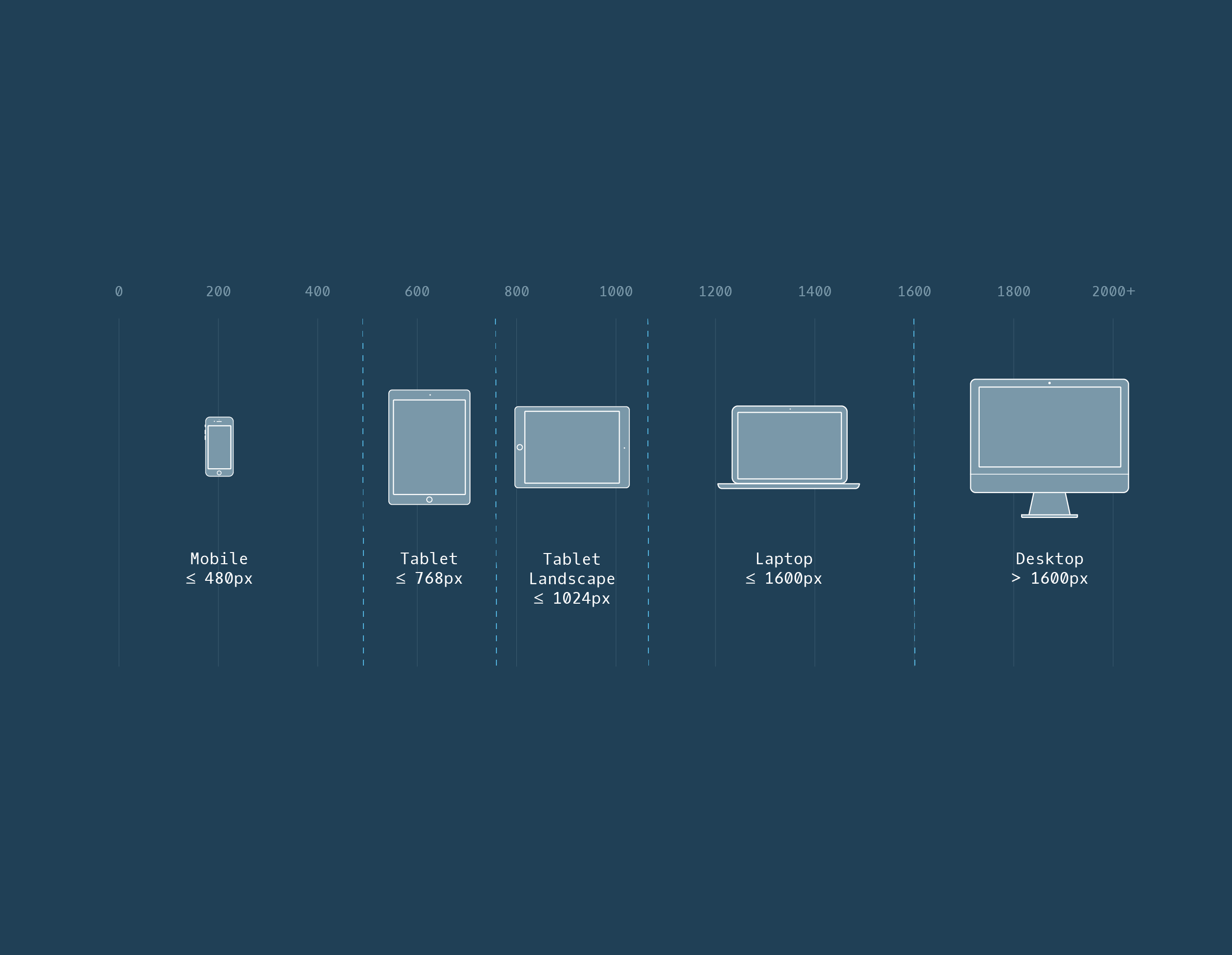
Viewport Meta Tag
the viewport relates to the size of screen a person is viewing your website on. i.e. a computer screen or mobile
the meta tag belongs in the head section of the HTML and specifies/instructs what the webpage's scale is.
We can break down the added <meta> tag into the following essential components:
- the
name="viewport"attribute: tells the browser to display the web page at the same width as its screen - the
contentattribute: defines the values for the<meta>tag, includingwidthandinitial-scale - the
width=device-widthkey-value pair: controls the size of the viewport in which it sets the width of the viewport to equal the width of the device - the
initial-scale=1key-value pair: sets the initial zoom level
example:
<!DOCTYPE html>
<html lang="en">
  <head>
    ...
    <meta name="viewport" content="width=device-width, initial-scale=1">
    ...
  </head>
Media Queries
CSS uses media queries to adapt based on screen sizes.
example:
@media only screen and (max-width: 480px) {
  body {
    font-size: 12px;
  }
}
@mediabegins the queryonlyscreen indicates the rule applies to one media type (in this case screens)and (max-width : 480px)a media feature or condition thats set. in this case, it applies the rule to devices up to 480px- the rules for the media query are then nested inside the
{}, in this case the bodies font size will be set to 12px - you can also establish ranges. there are two ways of doing that:
example 1: using AND in one media query
@media only screen and (min-width: 320px) and (max-width: 480px) {
    /* ruleset for 320px - 480px */
}
example 2: two separate media queries
@media only screen and (min-width: 320px) {
    /* ruleset for >= 320px */
}

@media only screen and (min-width: 480px) {
    /* ruleset for >= 480px */
}
-
you can also target screen resolution by using DPI → min-resolution: and max-resolution:
- you can replace images for other images based on this query…
so cool
- you can replace images for other images based on this query…
-
the and operator (like in the examples above) can be used to chain different rule sets.
- note that when you link rules in query this way then they will both need to be true for it to render
-
however, if we only want the media query to apply with ONE of the various rules being met then use a
,separator. -
you can use the AND and the
,together in the media query as needed
example using a , seperator
@media only screen and (min-width: 480px), (orientation: landscape) {
    /* CSS ruleset */
}
- a breakpoint is the point at which a media query is set.
- instead of trying to make breakpoints for every device imaginable (impossible) resizing the browser as you work on your site to see where those breaks naturally happen, will help you establish the breakpoints for your media queries
"By observing the dimensions at which a website naturally breaks, you can set media query breakpoints that create the best possible user experience on a project by project basis, rather than forcing every project to fit a certain screen size. Different projects have different needs, and creating a responsive design should be no different."
Semantics
- List of existing Semantic HTML elements : https://developer.mozilla.org/en-US/docs/Web/HTML/Reference/Elements
- Aria Roles: https://www.w3.org/TR/html-aria/#allowed-aria-roles-states-and-properties
- Aria Techniques: https://developer.mozilla.org/en-US/docs/Web/Accessibility/ARIA/Guides/Techniques
- ARIA roles assist screen readers to determine the "role" of elements on a page
- we can instruct readers to ignore or skip elements by role='none'
- the 'presentation' role will only read the "presented" info. in the example below, it would read the "div" outloud
<div id="container" role="presentation">
  <p>I'm content you want to hear!</p>
</div>
- ARIA labels give screen readers additional info to read aloud. example below:
<img src="#" alt="A painting of the Shenandoah Valley"/>
<p aria-label="Artist">Armand Cabrera, 2010</p>
- ALT attribute is like an ARIA label with added functionality. the text WILL appear on screen if something happens with the original element. ARIA labels will never be displayed on screen
When using the alt attribute, you should adhere to these conventions:
- In general, the value of
altshould concisely describe the image. - For images that are also
<a>elements, thealtattribute should describe the source that the link targets. - If an image conveys no information (such as a decorative border), the
altattribute should be empty, but should never be omitted. - If an image is described by text near the image, do not duplicate the description in the
altattribute. Use an emptyaltattribute instead. - The value of an
altattribute should be no more than 150 characters.
Documentation & Research
Flex
Flex containers have two axes: a main axis and a cross axis. By default, the main axis is horizontal and the cross axis is vertical.
The main axis is used to position flex items with the following properties:
justify-contentflex-wrapflex-growflex-shrink
The cross axis is used to position flex items with the following properties:
align-items- used to align on one rowalign-content- used to align multiple rows
BUT we can switch them by using flex-direction:
columnrowrow-reversecolumn reverse
The flex-flow property is declared on flex containers.
Flex Properties Review
display: flexchanges an element to a block-level container with flex items inside of it.display: inline-flexallows multiple flex containers to appear inline with each other.justify-contentis used to space items along the main axis.align-itemsis used to space items along the cross axis.flex-growis used to specify how much space (and in what proportions) flex items absorb along the main axis.flex-shrinkis used to specify how much flex items shrink and in what proportions along the main axis.flex-basisis used to specify the initial size of an element styled with flex-grow and/or flex-shrink.flexis used to specifyflex-grow,flex-shrink, andflex-basisin one declaration.flex-wrapspecifies that elements should shift along the cross axis if the flex container is not large enough.align-contentis used to space rows along the cross axis.flex-directionis used to specify the main and cross axes.flex-flowis used to specifyflex-wrapandflex-directionin one declaration.- Flex containers can be nested inside of each other by declaring
display: flexordisplay: inline-flexfor children of flex containers.
Transitions
Git
- Git is the industry-standard version control system for web developers
- Use Git commands to help keep track of changes made to a project:
git initcreates a new Git repositorygit statusinspects the contents of the working directory and staging areagit addadds files from the working directory to the staging areagit diffshows the difference between the working directory and the staging areagit commitpermanently stores file changes from the staging area in the repositorygit logshows a list of all previous commits